hho cash, in black and white, magenta and green
a self-custody superapp needs a mark people trust on sight — the contrast, a lowercase voice, and one consistent system across every surface.
lowercase, direct, no hype
use "hho" as a brand, not just an app name. it's a play on hydrogen, hydrogen, oxygen — h2o, water. we want hho to be just as simple, just as essential.
- always lowercase — headlines, buttons, labels. no exceptions, no title case.
- state it plainly — say what the product does. skip adjectives that carry no information.
- no exclamation points, no emoji — confidence reads quieter than enthusiasm.
"send money with @handle"
"gas on us"
"self custody as it should be"
the mark
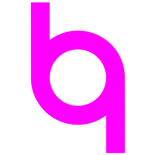
the mark springs out of a water molecule and crudely shows oxygen's link with two hydrogens. it's also a composite of our brand's letters, as every good logo should be.


 cash
cash
cash
cash
mark 64px, "cash" 60px light in readex pro; horizontal lockup — 16px gap, wordmark nudged 6px up; stacked — 12px gap, mark 3px left, both to align optical centers.
- 24px is the hard floor. below it the counter closes and the mark reads as a blob. 32px and up is where it should sit by default.
- clearspace equal to the mark's own height on every side.
- minimum size 20px tall in interfaces, 0.25in in print.
- white on dark surfaces, black on light ones — never any other colour, never rotated or stretched.
the mark, mishandled
- ✕ don't stretch or distort the mark
- ✕ don't rotate it
- ✕ don't add drop shadows or effects
- ✕ don't recolour outside the palette
- ✕ don't place it on busy or low-contrast backgrounds
- ✕ don't capitalize the wordmark — it stays lowercase
- ✕ don't blur it, and don't export it below the size it's used at
- ✕ don't set lockups in another typeface — readex pro only
our palette
primary: magenta. neutrals: black, white, grey. secondary: green. black and white carry the brand; magenta and green are the only two accents, used sparingly.
| magenta | #FF00FF · primary accent |
| green | #00FF00 · secondary accent |
| black | #000000 · ink |
| white | #FFFFFF · paper |
| grey ramp | #F0F0F0 · #999999 · #333333 |
spectrum — for marketing and social, never in product surfaces:
| magenta dark / light | #CC00CC · #FF33FF |
| green dark / light | #00CC00 · #33FF33 |
| black 10 / 20 | #1A1A1A · #333333 |
| white 80 / 90 | #CCCCCC · #E6E6E6 |
no gradients. no opacity, layering or other effects. never hero a colour other than magenta, green, black or white. don't overuse the primary.
readex pro
one typeface, always lowercase. light (300) for body copy, bold (700) for headlines and figures. no italics.
| 40 — headlines | bold |
| 20 — body | light |
| 16 — labels | light |
| 14 — fine print | light |
three pillars, one system
hho cash has no sub-brands — send, save and grow are features, not separate identities. same type, same monochrome palette, same components. the only distinction is the word itself.
| send | @handle transfers |
| save | no-fee yield |
| grow | copy-trading |
slow, deliberate, never decorative
every animation serves a state change — nothing moves just to move.
- theme pyramid — one full rotation every 10 seconds, linear, no easing
- background — plays on launch, no interaction, hard stop
- card stacks — 0.4s ease on transform and opacity
- faq chevrons — 0.25s ease on expand and collapse
infrastructure we build on
partner marks appear at a fixed height, in the current theme's ink only — never resized relative to each other, never placed inside a card of their own.