in black & white magenta & green
a self-custody superapp needs a mark people trust on sight - the contrast, a lowercase voice, and one consistent system across every surface.
it's your wallet that sends, saves and grows your funds
so, we built on base, with key security reliability of privy, connected to savings curated by steakhouse financial through morpho. hho cash gives people @handle transfers with no gas charges, savings with no management fee, and exclusive trading strategies, without ever taking custody of their funds. the brand has to carry that trust with as little noise as possible.
lowercase, direct, no hype
use "hho" as a brand, not just as an app name. it's a play on hydrogen, hydrogen, oxygen — h₂o, water. we want hho to be just as simple, just as essential.
headlines, buttons, labels — no exceptions, no title case
say what the product does. skip adjectives that don't carry information.
confidence reads quieter than enthusiasm.
"send to @handle"
"gas on us"
"self custody as it should be"
mark, lockups & the moon
we call the hho logo a "mark" — it springs out of a water molecule and crudely shows oxygen's link with two hydrogens. it's also a composite of our brand's letters, as every good logo should be.
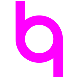 magenta · 256x256px · png
 green · 256x256px · png
 black · 256x256px · png
 white · 256x256px · png
the mark is drawn in a square 1024×1024 frame. the outer ring and the two vertical stems share one constant stroke weight (124 units — about an eighth of the frame, not tapered). the negative-space circle (the "o" of oxygen) is centered on the frame; its outer radius is about a third of the frame height, and the inner counter is exactly 0.6× that radius. clearspace is built into the artwork: match the stem width when you pad the mark in layouts.
the mark is vector programmable and its .svg code can be copied here:
<svg width="1024" height="1024" viewBox="0 0 1024 1024" xmlns="http://www.w3.org/2000/svg">
<path fill="#000000" fill-rule="nonzero" d="
M202,16 L326,16 L326,512 L202,512 Z
M698,512 L822,512 L822,1008 L698,1008 Z
M202,512 A310,310 0 1 1 822,512 A310,310 0 1 1 202,512 Z
M326,512 A186,186 0 1 0 698,512 A186,186 0 1 0 326,512 Z
"/>
</svg>below 24px the counter closes and the mark reads as a blob — don't use it there. 24px is the hard floor; 32px and up is where it should sit by default.

 16×16px · png
avoid
16×16px · png
avoid

 24×24px · png
minimum
24×24px · png
minimum

 32×32px · png
recommended
32×32px · png
recommended

 64×64px · png

 128×128px · png
256×256px · png
128×128px · png
256×256px · png

 512×512px · png
leave room equal to the mark's 1/4 height on every side. minimum size: 20px tall in interfaces, 0.25in in print. the mark ships white for dark surfaces and inverts to black for light surfaces — the only other colors are magenta or green, never rotated or stretched.


the mark almost never travels alone on product surfaces. pair it with the word "cash" — not "hho.cash" — in readex pro light. horizontal for headers and wide layouts; stacked for tight rails like the site nav. nudge the type until the optical center of the letters sits with the center of the ring, not the bounding box. mark in the lockups can vary by accent colors, while "cash" always stays black or white.
mark 64px, "cash" 60px light in readex pro, 16px gap between mark and text, wordmark nudged 6px up relative to the mark to align optical centers.
mark 64px, "cash" 60px light in readex pro, 12px gap between mark and text, mark nudged 3px left and "cash" nudged 6px up to align optical centers.
lockup variants
where mark cannot be displayed, in plain text or is creatively required, use "hho.cash" in logotype format, retaining readex pro light typeface and only in horizontal layout. we don't like mixing mark with hho.cash and neither should you. same coloring logic applies to the logotype and lockups — "hho" can be colored black, white, magenta, or green, while "cash" always stays black or white.
"hho.cash" 60px light in readex pro, no gaps in text, no nudging
logotype variants
the moon is the only recurring motif beyond the mark — a half-and-half circle that lives in the nav as the theme switch. no icon library, no sun. just a split disc: one side night, one side day. on dark surfaces it reads white|black; flip the theme and it inverts to black|white. same geometry, swapped halves. it should always feel like a control, not a logo.
the mark, mishandled
the mark is an effective brand, when used properly. here — it's used poorly
don't stretch or distort the mark
don't rotate the mark
don't add drop shadows or effects
don't recolor outside the palette

don't place on busy backgrounds
don't capitalize the wordmark
don't use mark with hho.cash
hho.cashdon't blur the mark
don't overpixelate the mark

don't use the wrong typeface
cashour palette
primary: magenta. neutrals: black, white, grey. secondary: green.
black and white carry the brand; magenta and green are the only two accents, used sparingly for emphasis, mark variants and interactive moments — don't introduce a third color into hho cash surfaces.
black
the ink. dark theme background, light theme text. this is the primary color, used for the majority of content
white
the paper. dark theme text, light theme background. this is the primary color, used for the majority of backgrounds
magenta
the primary accent on light theme and white backgrounds, the secondary accent on black backgrounds
green
the primary accent on dark theme and black backgrounds, the secondary accent on white backgrounds
the brand primary color combinations are black, white and magenta, or black, white and green. the spectrum palette can be used to enrich marketing and social content. no colors outside the brand palette may be used.
brand primary color combinations
brand secondary color combinations
our spectrum color usage is very intuitive — we do not use color spectrum.
one can always go wrong with colors, it's not a big deal, but try to stick to the common visual sense
do not use gradients
do not lead with secondary colors
do not oversimplify the brand
do not overuse accent color
self custody superapp
no gradients. no opacity, layering or other visual effects. never hero a color other than black or white, magenta or green. don't make the brand feel elementary. don't overuse the primary color.
how to readex pro
readex pro is our primary and only typeface. we adopted it as our graphic identity and use its legibility as an instrument in the evolving self custody perimeter. one typeface, always lowercase. light (300) for body copy, bold (700) for headlines and figures. no italics.
readex pro is designed by thomas jockin, nadine chahine, bonnie shaver-troup, santiago orozco, héctor gómez and is provided by google fonts at: https://fonts.google.com/specimen/Readex+Pro
hho.cash uses english lower case glyphs, numbers, punctuations, currency symbols, and marks of readex pro
deviate if you must, but try sticking to these font sizes:
35–61px · weight 600
headlines · section titles · hero · clamp(2.2rem, 6vw, 3.8rem)
32px · weight 300 · light
section labels · lockup word · eyebrow
15px · weight 300 · light
paragraphs · descriptions · UI copy
12px · weight 300 · light
captions · legal · meta
mark — always on
the favicon mark lives on open tabs wherever hho.cash web content is present. only two versions exist - black & white


the first impression
the mark is the first thing on a home screen — one silhouette, no wordmark, no extra chrome. it has to be recognizable at a glance and feel like the same brand on every device. ios clips a squircle, android a circle, but the graphic inside is identical: 128px mark, dead-centered on black. white is the default; green is the only accent. never mix the two on one store listing, never add a drop shadow, never draw a different mark for either platform.
 ios · white on black · 128px mark · png
 ios · green on black · 128px mark · png
 android · white on black · 128px mark · png
 android · green on black · 128px mark · png
three pillars, one system
hho.cash has no sub-brands — send, save, and grow are features, not separate identities. they share every rule on this page: same type, same monochrome palette, same card and tag components. the only distinction is the word itself.
@handle transfers
no-fee yield
copy-trading
slow, deliberate, never decorative
every animation in the product serves a state change — nothing moves just to move. the moon: one full rotation to show switch between the light and dark.
mercury (landing): a one-shot playback of the face rotation runs on launch, then hard-stops. after playback, spring reform settles particles to their home positions and mouse or touch repulsion unlocks for engagement. particles invert with the theme — dark ink on light, light ink on dark.
section switches on the landing are hard cuts — no scroll theatre, no ambient loops. if it isn't marking a state change, it doesn't move.
infrastructure we build on
these are the teams our product actually runs on, not a logo wall. send & request run on base. keys sit with privy. savings link to morpho vaults, curated by steakhouse. strategies execute on hyperliquid. fiat in and out is orchestrated through stripe, bridge, moonpay, and meld.
partner marks appear at a fixed 64px height, in the current theme's ink only. never recolor them magenta or green, never put them in a card, never stretch them to fill a grid. same height so no partner looks louder than another. white lockup on dark surfaces, black lockup on light. they follow the sentence that names what they do — they don't sit next to the hho mark as a co-brand.

















2026 hho cash llc